Credits:
Design by Jessica Sprague
* Ledger background paper (lumiere): from La Paperie No. 1 Paper Pack by Jen Wilson
* Yellow vertical paper (definingflowers): from Nostalgia No. 1 Paper Pack by Jen Wilson
* Blue patterned paper: from Keeping Up with the Jones - Home kit by Trish Jones
* Striped patterned paper: from King Me kit by Katie Pertiet
* Red paper strip: from Meaning 4 Elements pack by Jen Wilson
* Flourish frame: from Shmootzy Frames, Vol. 3 by Nancie Rowe Janitz
* Flourish brush: from A La Mode Brush Set by Mary Ann Wise
* Hemp tie ribbon: from Star Chasers kit by Katie Pertiet
* Jewelry Tag: from Tiny Tags set by Linda Gil Billdal
* Button: from Barcelona kit by Lynn Grievson
(several items recolored)
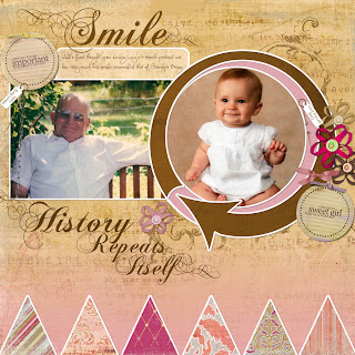
My favorite technique from this layout was the compound mask we created using the PS drawing tools (the circles and round blue mat). Our challenge layout for week 1 was to create our own compound mask design and repeat some of the other techniques from the week 1 layout. Here's what I created:

Lesson 1b for Jessica Sprague's Digi in Deep course...compound mask inspired by Jessica's challenge but created by me using drawing tools and a custom shape (the arrow).
Triangles at the bottom inspired by Jen Wilson's previews for her Laundry Line as well as a layout by Kelleigh.
Jen Wilson Nostalgia 1: background paper, blended with a solid from her Laundry Line.
Triangle papers: Emily & Annie from JW's Laundry Line
Other items from Laundry Line: flowers and circle tags.
Brown paper: Trish Jones "Keeping up with the Joneses: The House" (recolored)
Shmootzy Frames Volume 3 by Nancy Rowe Janitz
Katie Pertiet hat pin & tag
CK Becky font and Chopin script
Scrap Girls ABR Beloved ribbon tie (recolored) & TCS Pen & Ink flourish brush (to embellish the edges of the title)
This fulfills all the challenge criteria for lesson 1b at Digi in Deep!
(# Add a title by combining brushes and fonts
# Use a clipping mask or a layer mask to "wrap" a ribbon around another item
# Add your journaling in a semi-transparent block
# Add a pop to a photo using a blended, feathered overlay)


5 comments:
Love both of your new digi layouts! Is that your Dad or Grandpa in the "Smile" layout and yes, Michael's smile is identical.
That's Jeff's grandpa, and the baby is Lucy, my niece:)
These are SO GORGEOUS Cheri!
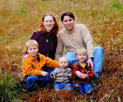
WOW! I love how unique the movement is in the 2nd one, and what a pair of photos! Wonderful!
The LO's are beautiful! You're really doing great stuff with digital, Cheri. Those photos are amazing.
Cheri, I LOVE your LO's. They look so complex compared to what I have tried to do digitally. Your challenge LO turned out beautifully, love the arrow.
Joellyn
Post a Comment