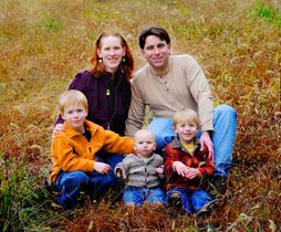
Super simple layout for my friend Amy...I used photo corners and kept it simple so she could take the photo out and frame it for awhile if she wants to. Were it not professional, I would have probably added a rubon title/something to all the white space in the photo.


2 comments:
*grinning* there's still time to print up what you want to say on a transparency, and adhere it like a flip-page. But I really like the simplicity of this one- makes S's picture really stand out!
That's a good idea, Janalee! When the birthday excitement winds down this weekend I'll do that:)
(Michael turns 2 tomorrow, so it's PARTY TIME!:)
Post a Comment